Announcement
Look At The Data!
"You can observe a lot by watching." --Yogi Berra
The first thing to do with any data set is look at it. If it fits on
a single page, look at the raw data values. Plot them: histograms, dot
plots, box plots, schematic plots, scatterplots, scatterplot matrices,
parallel plots, line plots. Brush the data, lasso them. Use all of your
software's capabilities. If there are too many observations to display,
work with a random subset.
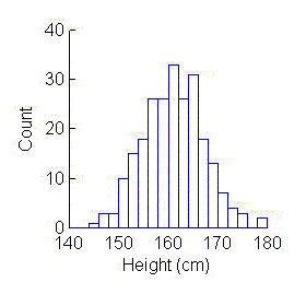 The most familiar and, therefore, most commonly used displays are
histograms and scatterplots. With
histograms, a single response (measurement, variable) is divided into a
series of intervals, usually of equal length. The data are displayed as a
series of vertical bars whose heights indicate the number of data values
in each interval.
The most familiar and, therefore, most commonly used displays are
histograms and scatterplots. With
histograms, a single response (measurement, variable) is divided into a
series of intervals, usually of equal length. The data are displayed as a
series of vertical bars whose heights indicate the number of data values
in each interval.
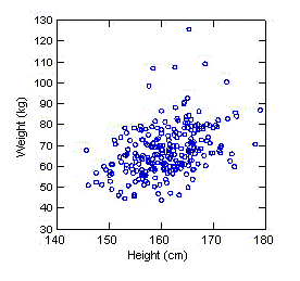 With
scatterplots, the value of one variable is plotted against the value of
another. Each subject is represented by a point in the display.
With
scatterplots, the value of one variable is plotted against the value of
another. Each subject is represented by a point in the display.
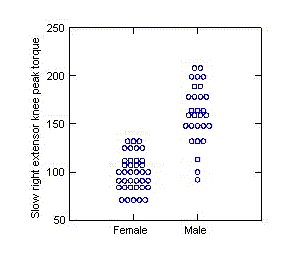 Dot plots (dot density displays) of a single
response show each data value individually. They are most effective for
small to medium sized data sets, that is, any data set where there aren't
too many values to display. They are particularly effective at showing
how one group's values compare to another's.
Dot plots (dot density displays) of a single
response show each data value individually. They are most effective for
small to medium sized data sets, that is, any data set where there aren't
too many values to display. They are particularly effective at showing
how one group's values compare to another's.
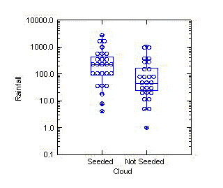
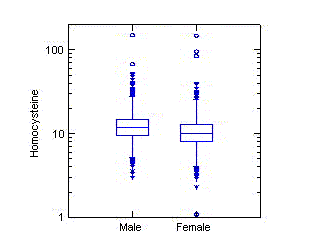 When there are too
many values to show in a dotplot, a box plot can be used instead. The
top and bottom of the box are defined by the 75-th and 25-th percentiles
of the data. A line through the middle of the box denotes the 50-th
percentile (median). Box plots have never caught on the way many thought
they would. It may depend on the area of application. When data sets
contain hundreds of observations at most, it is easy to display them in
dot plots, making graphical summaries largely necessary. However, the
box plots make it easy to compare medians and quartiles, and they are
indispensible when displaying large data sets.
When there are too
many values to show in a dotplot, a box plot can be used instead. The
top and bottom of the box are defined by the 75-th and 25-th percentiles
of the data. A line through the middle of the box denotes the 50-th
percentile (median). Box plots have never caught on the way many thought
they would. It may depend on the area of application. When data sets
contain hundreds of observations at most, it is easy to display them in
dot plots, making graphical summaries largely necessary. However, the
box plots make it easy to compare medians and quartiles, and they are
indispensible when displaying large data sets.
 One problem with box
plots is that they always give the impression that data are unimodal. The
plots to the left display the duration of erruptions of Old Faithful Geyser at
Yellowstone National Park taken during two one-week periods. One thing it
shows is it that Old Faithful is only "kind of faithful". The duration times
can vary not only vary considerably but also they are bimodal. There's the 2
minute version, give or take 15 seconds, and the 4 minute 15 second version,
give or take 30 seconds.
One problem with box
plots is that they always give the impression that data are unimodal. The
plots to the left display the duration of erruptions of Old Faithful Geyser at
Yellowstone National Park taken during two one-week periods. One thing it
shows is it that Old Faithful is only "kind of faithful". The duration times
can vary not only vary considerably but also they are bimodal. There's the 2
minute version, give or take 15 seconds, and the 4 minute 15 second version,
give or take 30 seconds.
 Printing a box plot
on top of a dot plot has the potential to give the benefits of both
displays. While I've been flattered to have some authors attribute these
displays to me, I find them not to be as visually appealing as the dot
and box plots by themselves...unless the line thicknesses and symbol
sizes are just right. The diagram to the left isn't too bad.
Printing a box plot
on top of a dot plot has the potential to give the benefits of both
displays. While I've been flattered to have some authors attribute these
displays to me, I find them not to be as visually appealing as the dot
and box plots by themselves...unless the line thicknesses and symbol
sizes are just right. The diagram to the left isn't too bad.
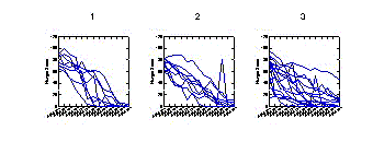 Parallel
coordinate plots and
Parallel
coordinate plots and
 line plots (also known as profile plots) are ways of following
individual subjects and groups of subjects over time.
line plots (also known as profile plots) are ways of following
individual subjects and groups of subjects over time.
 Most numerical
techniques make assumptions about the data. Often, these conditions are
not satisfied and the numerical results may be misleading. Plotting the
data can reveal deficiencies at the outset and suggest ways to analyze
the data properly. Often a simple transformation such as a log, square
root, or square can make problems disappear.
Most numerical
techniques make assumptions about the data. Often, these conditions are
not satisfied and the numerical results may be misleading. Plotting the
data can reveal deficiencies at the outset and suggest ways to analyze
the data properly. Often a simple transformation such as a log, square
root, or square can make problems disappear.
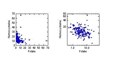
The diagrams to the left display the relationship between homocysteine
(thought to be a risk factor for heart disease) and the amount of folate
in the blood. A straight line is often used to describe the general
association between two measurements. The relationship in the diagram to
the far left looks decidedly nonlinear. However, when a
logarithmic transformation is applied to both variables, a straight line
does a reasonable job of describing the decrease of homocysteine with
increasing folate.
What To Look For:
A Single Response
The ideal shape for the distribution of a single response variable is
symmetric (you can fold it in half and have the two halves match) with a
single peak in the middle. Such a shape is called normal or a
bell-shaped curve. One looks for ways in which the data depart
from this ideal.
- Are there outliers--one or two observations that are
far removed from the rest? Are there clusters as evidenced by multiple
peaks?
- Are the data skewed? Data are said to be skewed if one of the
tails of a histogram (the part that stretches out from the peak) is
longer than the other. Data are skewed to the right if the right tail is
longer; data are skewed to the left if the left tail is longer. The
former is common, the latter is rare. (Can you think of anything that is
skewed to the left?) Data are long-tailed if both tails are longer than
those of the ideal normal distribution; data are short-tailed if the
tails are shorter. Usually, a normal probability plot is needed to assess
whether data are short or long tailed.
 Is there more than
one peak?
Is there more than
one peak?
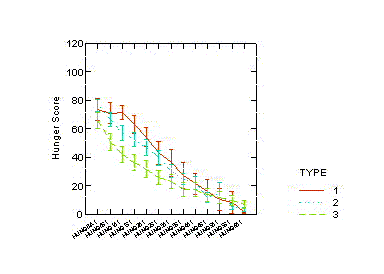
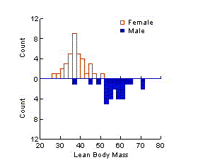 If data can be
divided into categories that affect a particular response, the response
should be examined within each category. For example, if a measurement is
affected by the sex of a subject, or whether a subject is employed or
receiving public assistance, or whether a farm is owner-operated, the
response should be plotted for men/women, employed/assistance,
owner-operated/not separately. The data should be described according to the
way they vary from the ideal within each category. It
is helpful to notice whether the variability in the data increases
as the typical response increases.
If data can be
divided into categories that affect a particular response, the response
should be examined within each category. For example, if a measurement is
affected by the sex of a subject, or whether a subject is employed or
receiving public assistance, or whether a farm is owner-operated, the
response should be plotted for men/women, employed/assistance,
owner-operated/not separately. The data should be described according to the
way they vary from the ideal within each category. It
is helpful to notice whether the variability in the data increases
as the typical response increases.
Many Responses
The ideal scatterplot shows a cloud of points in the outline of an ellipse.
One looks for ways in which the data depart from this ideal.
- Is the cloud of points something other that elliptically shaped, that is,
does it look like something other than a football or a circle?
- Are there outliers, that is, one or two observations that are removed
from the rest? It is possible to have observations that are distinct from
the overall cloud but are not outliers when the variables are
viewed one at a time! Are there clusters, that is, many distinct clouds
of points?
- Do the data seem to be more spread out as the variables increase in
value?
- Do two variables tend to go up and down togther or in opposition
(that is, one increasing while the other decreases)? Is the association
roughly linear or is it demonstrably nonlinear?
Comment
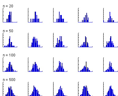 If the departure
from the ideal is not clear cut (or, fails to pass what L.J. Savage
called the "Inter-Ocular Traumatic Test"--It hits you between the eyes!),
it's not worth worrying about. For example, consider this display which
shows histograms of five different random samples of size 20, 50, 100,
and 500 from a normal distribution. By 500, the histogram looks like the
stereotypical bell-shaped curve, but even samples of size 100 look a
little rough while samples of size 20 look nothing like what one might
expect. The moral of the story is that if it doesn't look worse than
this, don't worry about it!
If the departure
from the ideal is not clear cut (or, fails to pass what L.J. Savage
called the "Inter-Ocular Traumatic Test"--It hits you between the eyes!),
it's not worth worrying about. For example, consider this display which
shows histograms of five different random samples of size 20, 50, 100,
and 500 from a normal distribution. By 500, the histogram looks like the
stereotypical bell-shaped curve, but even samples of size 100 look a
little rough while samples of size 20 look nothing like what one might
expect. The moral of the story is that if it doesn't look worse than
this, don't worry about it!
Copyright © 1999 Gerard E.
Dallal